Aldi Rebrand
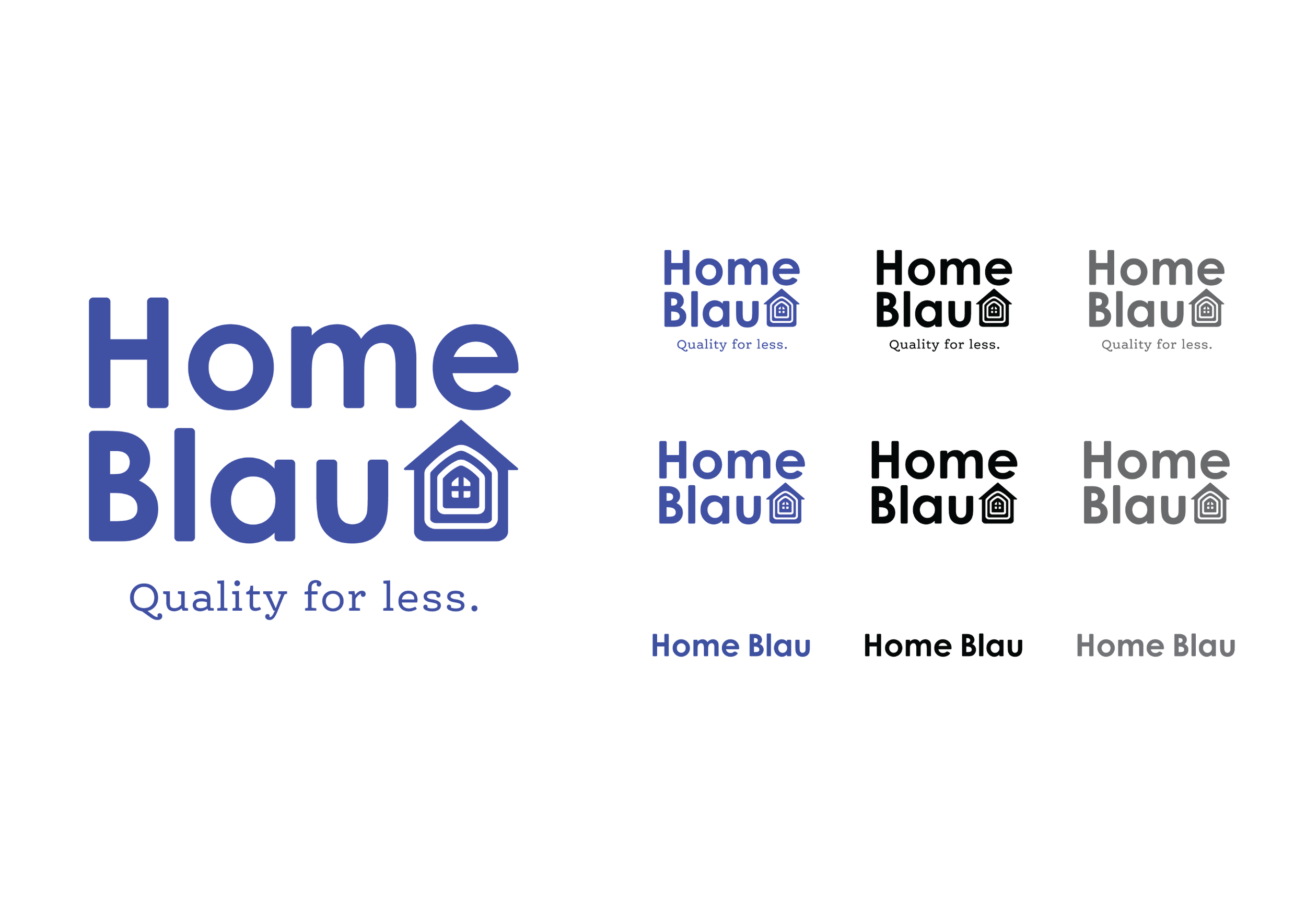
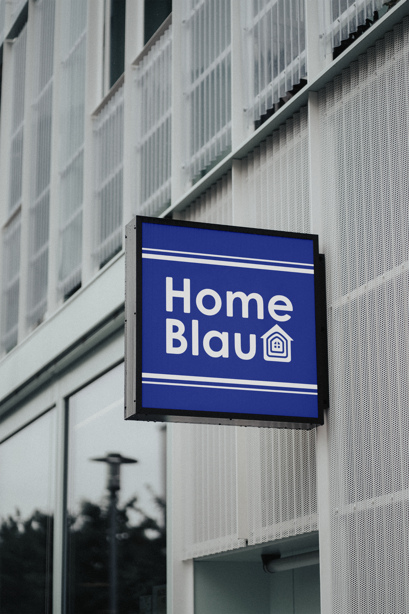
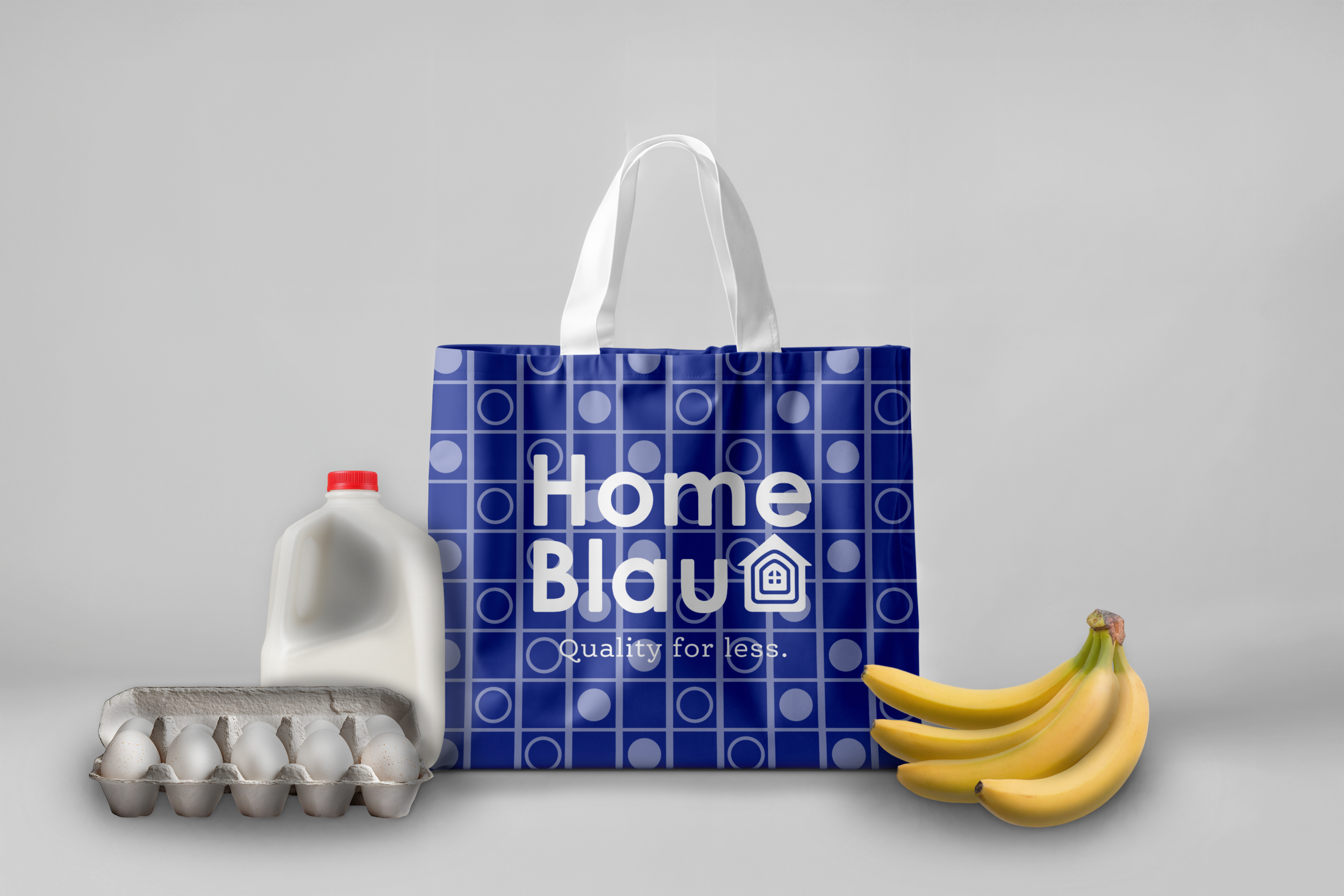
This rebrand alters the confused branding of the ALDI supermarket chain, to something cleaner and more community-orientated. The name has been changed to Home Blau with the first half obviously reflecting the welcoming aspect, while ‘Blau’ is the German word for ‘Blue’, relating to it’s main differentiating feature from the other supermarket chains being it’s colour scheme, as well as harkening back to the company’s roots in Essen, Germany.
The brandmark resembles a simple house with multiple lines transitioning towards the center, almost seeming like it has layers. This once again, evokes a feeling of community, supplemented by the window-like object in the middle. The shape surrounding it and the center-object are also meant to abstractly resemble a shopping basket.
To drive the aesthetic forward, the font is a rounded, sans-serif, which is easy to read and non-threatening.